Responsive Web Design Tips for a Seamless User Experience Across All Devices
Think about the last time you visited a website on your phone and had to pinch, zoom or scroll endlessly just to read the content. Frustrating, right?
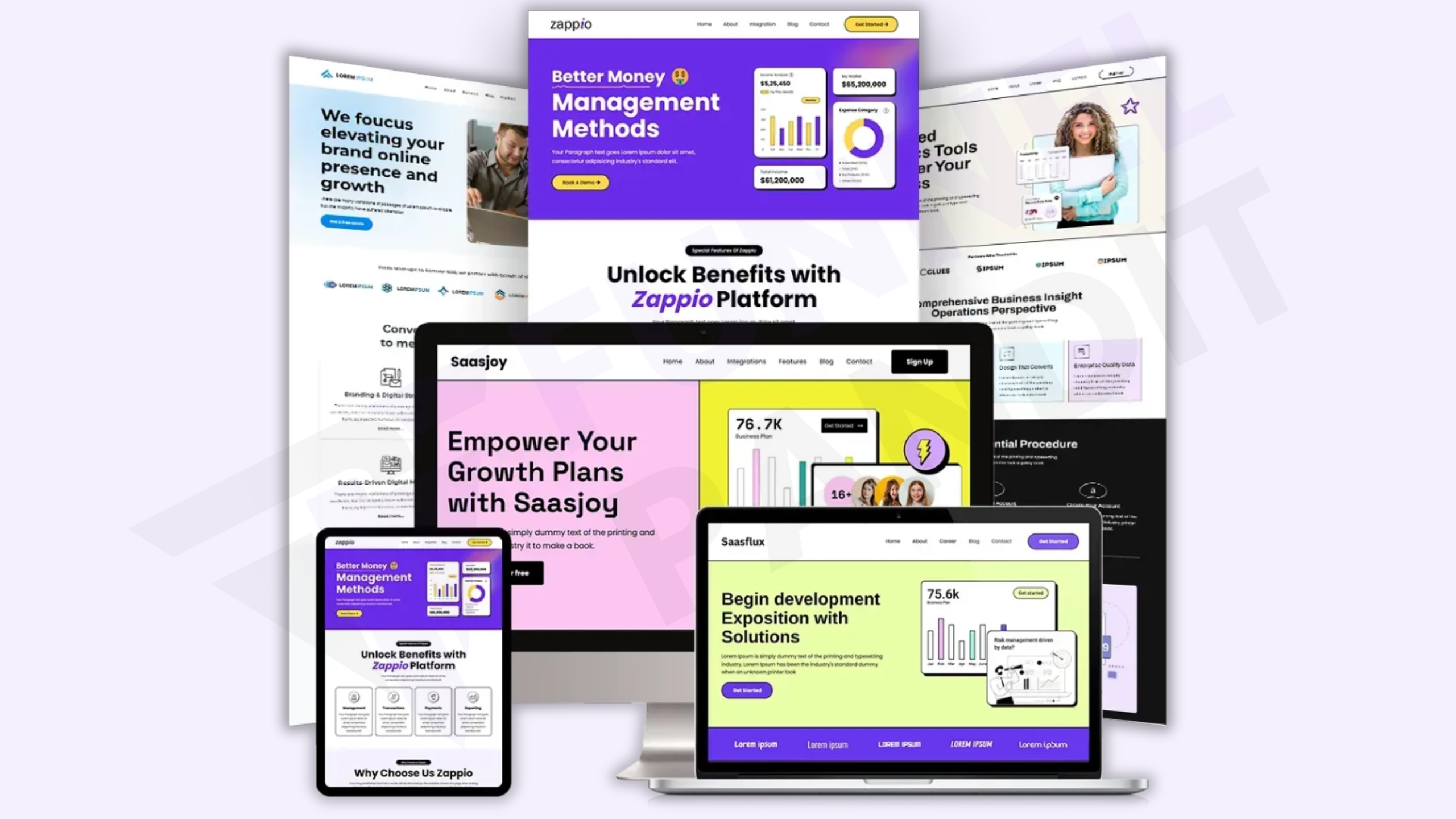
Now imagine a site that instantly adapts to your screen — whether you're using a phone, tablet or desktop. Everything looks clean, loads fast and functions perfectly. That’s the magic of responsive web design.
Also Read 👉What Parasite SEO Is and How It Helps You Rank Faster!
As users switch between devices more than ever before, websites must be able to deliver a smooth and intuitive experience regardless of screen size. In this guide, we’ll walk through the most effective responsive web design tips to help your site stand out, perform better and deliver an exceptional user experience on every device.
What Is Responsive Web Design?
Responsive web design is a web development approach that ensures your site layout, images, text and elements automatically adjust to the screen they’re viewed on — whether that’s a mobile phone, a tablet, a laptop or a smart TV.
It eliminates the need for multiple versions of your site and ensures consistency across all platforms.
Real-World Example:
Imagine you own a clothing brand. A visitor on a smartphone sees a mobile-friendly product catalog with big buttons and fast-loading images. That same visitor uses a desktop later and sees a full-page layout with filters and sidebar options. All of it is seamless — no extra effort from you or the user.
Why Is Responsive Design Important?

Responsive design is not just a trend. It’s a requirement.
Key Benefits:
Improved User Experience: Users stay longer and interact more with websites that look good and function well on their device.
Better SEO Rankings: Google rewards mobile-friendly websites with higher search engine rankings.
Higher Conversion Rates: A better experience means users are more likely to take action—whether it’s signing up, purchasing or contacting you.
Reduced Maintenance: You manage one website that works across all platforms, saving time and money.
Top 10 Responsive Web Design Tips
Let’s dive into the essential tips that every web designer or website owner should follow:

1. Use a Fluid Grid Layout
Instead of using fixed widths in pixels, use percentages so that elements scale proportionally to the screen size.
Tip:
css
CopyEdit
.container {
width: 90%;
}
This allows your layout to adjust dynamically as the screen size changes.
2. Embrace Mobile-First Design
Design your website starting with the smallest screens first. This ensures you prioritize core content and essential features from the beginning.
Example:
Start with a simple layout for mobile users. Then, use CSS media queries to progressively enhance the experience for tablets and desktops.
3. Make Images Flexible
Images should scale with the layout without overflowing or breaking.
Use this CSS:
css
CopyEdit
img {
max-width: 100%;
height: auto;
}
This ensures images automatically resize depending on the container’s width.
4. Implement Responsive Typography
Text that’s readable on desktop might be too small on mobile. Use relative units like em, rem, or vw to create scalable text.
Pro Tip:
css
CopyEdit
h1 {
font-size: clamp(1.5rem, 2.5vw, 3rem);
}
The clamp() function adjusts font size between a minimum and maximum value based on screen width.
5. Optimize Navigation for Smaller Screens
Menus can become cluttered on mobile. Use hamburger menus, dropdowns or off-canvas navigation to simplify the user experience.
Solution:
Convert a horizontal navigation bar into a vertical sidebar or dropdown menu when the screen width is below 768px.
6. Test Across Real Devices
Simulators are helpful, but nothing beats real-world testing. Check your website on phones, tablets and desktops to catch layout or functionality issues.
Tools to Use:
Chrome DevTools (Device Mode)
BrowserStack
Responsively App
7. Use Media Queries Effectively
Media queries allow you to apply different styles based on the device’s screen size.
Example:
css
CopyEdit
@media (max-width: 768px) {
.sidebar {
display: none;
}
}
This hides the sidebar on smaller screens to give more focus to the main content.
8. Avoid Fixed Width and Height Elements
Fixed elements can cause overflow on smaller devices. Always use flexible units and allow elements to resize naturally.
Tip:
Avoid hardcoding height or width in pixels. Instead, use min-width, max-width and relative units to maintain flexibility.
9. Ensure Tap Targets Are Large Enough
Buttons and links must be easy to tap on touchscreens. Make them large, spaced out and clearly visible.
Best Practice:
Keep tap targets at least 44x44 pixels with adequate spacing between them to avoid accidental taps.
10. Minimize Load Time for Mobile Users
Speed is crucial. A slow site means high bounce rates and lost conversions.
Speed Optimization Checklist:
Compress images (use tools like TinyPNG)
Minify CSS and JavaScript files
Use lazy loading for images
Leverage browser caching and CDNs
Common Responsive Design Mistakes to Avoid

Even experienced designers fall into these traps:
❌ Hiding important content on mobile
❌ Not testing on all major devices and browsers
❌ Using too many breakpoints
❌ Ignoring orientation changes (landscape vs portrait)
❌ Not optimizing for loading speed
Stay mindful of these to keep your site polished and professional.
Design Once, Delight Everywhere
Responsive web design is not a “nice-to-have”—it’s a must. With so many users browsing on mobile and tablet devices, your website has to be ready to adapt. By following the responsive web design tips above, you’ll create a user-friendly, professional site that performs well on any screen.
Start with a mobile-first mindset, use flexible layouts and always test your site in real-world scenarios. The result? Happier visitors, better engagement and higher SEO rankings.


